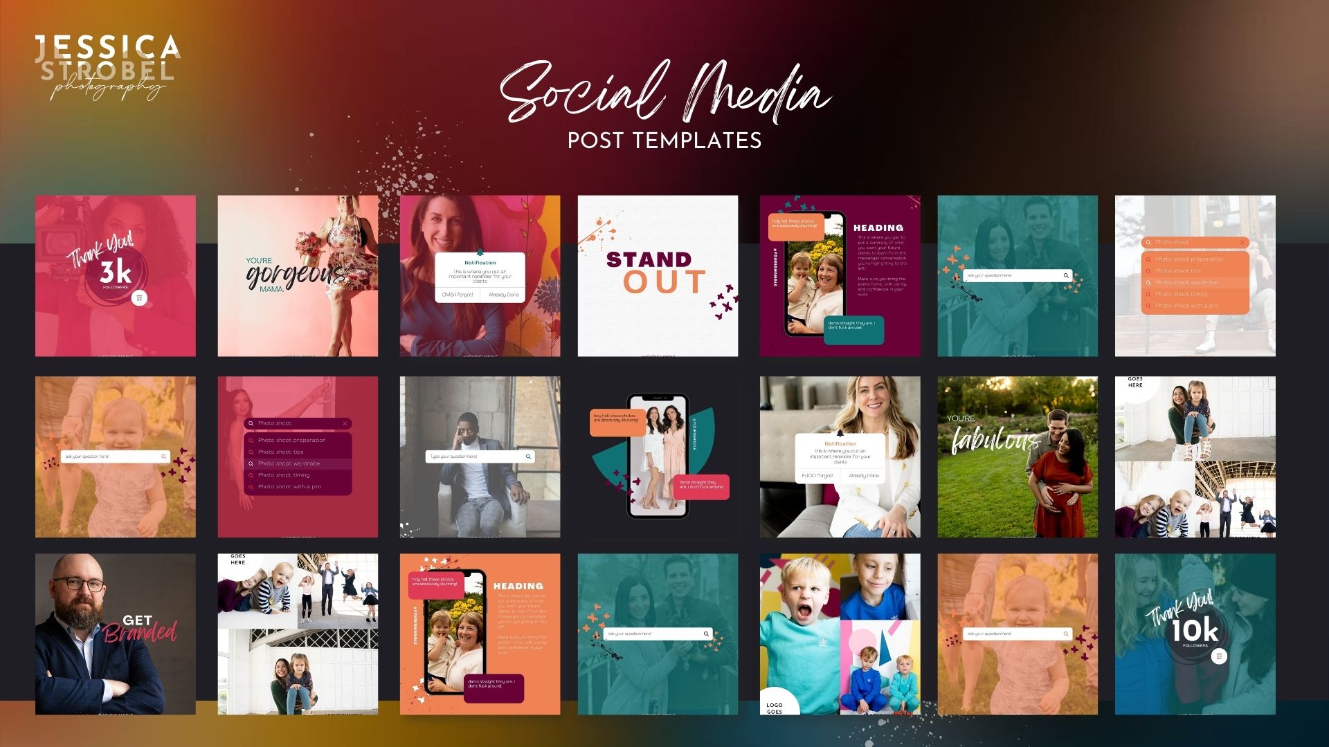
Canva Templates make things SO much easier!
Templates are great. I love them, so, so much. But templates on their own (unless they’ve been designed specifically for your own brand by a pro) aren’t going to start off perfect for your brand. The only real exception to that is if you have super neutral branding, and found a package of templates that lines up with that perfectly. (And honestly if your branding is super neutral… my own templates maaaaay not be the best choice of starting point!)
But really if you’re starting off with templates, you’re going to have to make some changes before you start using them. And if you own a Yoga studio, and are not a designer… that might feel a little bit like rocket science.
So, I’ve broken down the basics, that way you can walk through updating templates to match your brand EASILY and FAST!
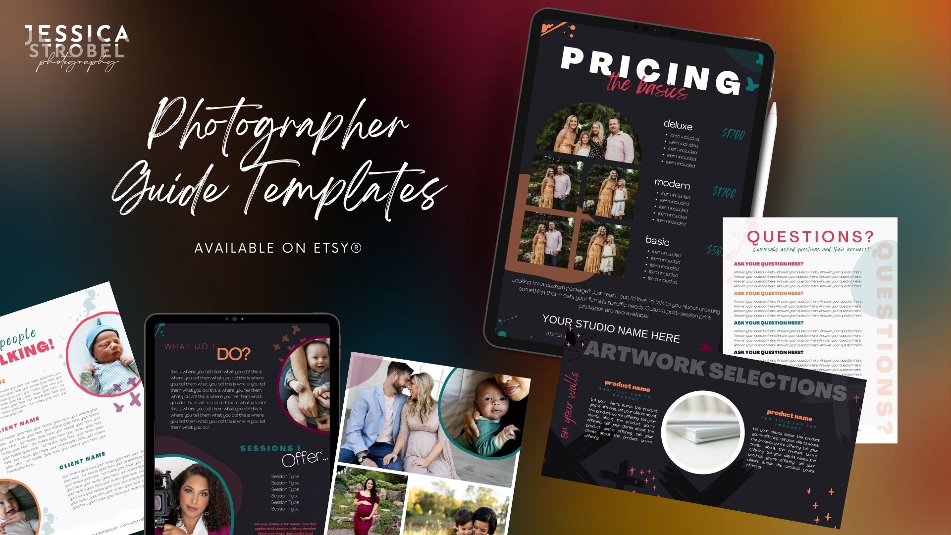
1. Think about COLOR
The first thing you’re going to want to think about, is color. I know this sounds obvious, but even if the templates you’re starting with are CLOSE to the palette you’ve selected for your business, you’re going to want to change them to match completely. Trust me. Your audience will KNOW if you’re using a slightly different blue. They might not be able to tell you what feels wrong about your latest Instagram carousel, but they’ll feel like something is “off”. And that’s NOT the kind of attention we want to be attracting on our social platforms!
2. Add your LOGO
Even if the templates that you’re using don’t have an assigned space for your logo in their designs (mine do, just so you know!) come up with a few spaces to add your logo into the designs in a way that blends in. It’s important to make sure that your audience sees your logo! After all, that’s why you have it.
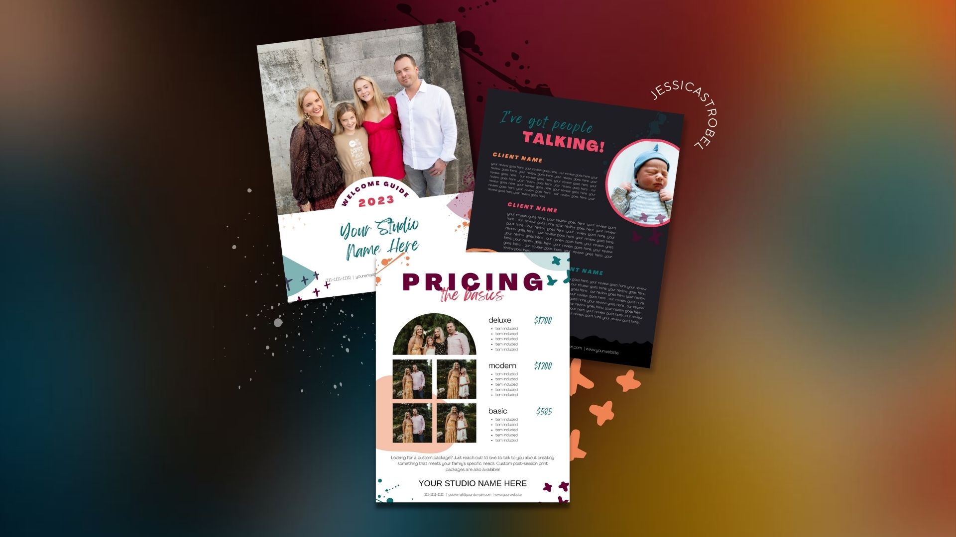
3. Replace your IMAGES
If you’re a photographer, this one is ALSO going to feel super obvious. But if you’re not, if you’re a lawyer or a retailer – it can be REALLY tempting to leave the stock images in the templates you’ve purchased. Especially if they’re specific to your industry and they look like they match.
But you’re going to want to replace at least SOME of those images with ones that have been taken at your location, for your business specifically! Otherwise, your audience isn’t going to get the same level of exposure to YOU, and YOUR business as they need to on your social media.
Don’t worry – if you don’t have professional imagery that you can drag and drop into your new templates… let me know!! I would absolutely love to talk about how we can set you up with a package of branded imagery and/or headshots to use all over your social media… and everywhere else.
4. Make your FONTS match!
This is a BIG one. Make sure your fonts match, and resist temptation to use every font in existence. I know it’s hard, but your social media will look so much more cohesive if you focus on two to three fonts that line up with your logo. Bonus points if they match the overall vibe of what you do!!


0 Comments